
Soma Reality
Redesigning a content moderation tool to reduce human errors
The Challenge
I was tasked with enhancing the content moderation system for Halfgram. Our challenge was to create a reliable and accurate moderation system that would enable moderators to make informed decisions during the filtering process. Without these improvements, incorrect judgments could be made, potentially making the community unsafe for its users.
Key results
Improved initial prototypes of the moderation tool
Admin console scalable for future internal tools
Ensured user trust and safe engagement
Methods
Research
Information architecture
Interaction design
Wireframing
Design system
UI prototyping
Role
Sole Product Designer
Team
Founder/Developer, Jeffrey Li
Timeline
8 weeks
What makes Halfgram unique?
Halfgram is a social media platform for sharing real, everyday stories through text and audio. It fosters genuine connections and community building with a cleaner, less disruptive social media experience that promotes positive interactions. Since 2018, the team has interviewed over 200 college students and young adults to shape the app based on their feedback. The app is available in the app store and has a growing beta user base of over 12,000.
The Solution
I improved the initial prototypes of the content moderation tool created by a previous designer. My redesign focused on making the experience both useful and intuitive for moderators while ensuring that the admin console was scalable for future internal tools. This new solution will help ensure safe user engagement and foster a trustworthy community.
Drag the center icon to toggle between the before and after versions!
Discovery
Defining the big problem
To address the need for a functional prototype, I conducted initial research through interviews with the lead developer/CEO, along with desk market research. These discussions provided insights into the future of Halfgram and the importance of a reliable content moderation system, allowing me to create a deliverable that could be refined later.
Market research says this tool valuable…
Understanding how moderators make decisions
With advancements in AI, content moderation has become faster and easier. However, when the AI model proves insufficient in making decisions, we must provide moderators with the right tools to easily identify important information and make informed decisions.

Human were moderators first…
How the redesign will contribute to business goals
Create a positive digital community
The redesigned moderation tool will create a space where users feel comfortable and have a positive experience using social media.
Build trust and safety
By ensuring reliable content moderation, the platform will develop an environment where users trust the platform and feel safe participating in both online and offline events.
Maintain open feedback channels
Includes features that facilitate an open loop between our team and our users, ensuring continuous improvement of the user experience.
The research above led me to identify 3 pain points from our current prototypes:
Unintuitive site organization
The hierarchy of information needs improvement to hold useful and more important information.
Inaccurate content review process
Moderators may need more than one review step to make accurate decisions.
Missing decision-making functions
With more unique use cases, we may need additional functions for moderators.

Audit of the old prototype
Additionally, I had to work with some constraints…
Limited manpower
I needed to prioritize core functionalities to achieve maximum impact. This meant implementing a simpler design system to streamline development and ensure efficiency.
Limited research bandwidth
Our lead developer prioritized delivering a functional prototype first, with plans to iterate based on research if needed. I gathered enough insights to create a deliverable that could be refined later.
Scalability for future features
The moderation tool is not a standalone feature and will be integrated into the admin console. This required redesign of the console to properly accommodate this tool and other future features.
With all this in mind, I had a goal and 4 objectives…
The goal:
Redesign the content moderation tool to be scalable for future features, ensure a thorough review process, and enable informative and accurate filtering, allowing moderators to make more informed decisions. The result is a safer and more trustworthy digital community.
How i'm going to get there?
Rearrange the admin console sitemap
Create additional review steps for filter accuracy
Update decision support tools and add contextual information
Develop a simple yet informative visual language
Information architecture
Rearrange admin console sitemap
After discussing with the lead developer, we realized that the information hierarchy throughout the system needed an update. The moderation system is not the only tool housed in the admin console, so we needed to consider the future addition of more tools and content as we develop new features for our mobile app users. This approach ensures that the system remains organized and scalable.
Future-proofing the sitemap
One goal of my redesign was to improve the information architecture by enhancing the menu structure. This included creating a top bar and a side menu, and applying the growth principle to future-proof the menus for upcoming features.
Final navigation redesign with a top nav bar and sidebar for specific functions
User flows & interaction design
Create additional review steps
After clarifying the information architecture, my next focus was on improving the flows of the design, which are essential to the tool's functionality. Understanding the flaws in this step would help me determine the screens, elements, and components needed in the next stages of the design.
Addressing uncertainty and human subjectivity
In discussions with our lead developer, we realized that moderators currently have only one decision-making point, making them prone to uncertainty and mistakes without a secondary reviewer. This issue is particularly challenging when dealing with ambiguous content. Consider the visuals below.

Old review flow

Updated review flow!
Adding more review stages to diminish human error
Introducing an additional reviewer can enhance accuracy and reliability in the moderation process. My goal at this stage was to establish subcategories for the review stages. Given our current user base size, I implemented two review stages. This allows moderators to coordinate with each other on content that needs further review, ensuring a more thorough and reliable moderation process.

I added two more stages in addition to the initial review
functional specifications
Revamping decision support tools
The old "under review" tasks lacked essential tools and features needed for making accurate and consistent decisions. It was missing critical data, such as the nature of the report, the user’s history, and any contextual information.
Here are a few explorations followed by the selected one!

Previous "under review" tasks
Exploration 1
Initially, the tasks were designed as a list instead of cards. In this iteration, I included contextual information such as user history and Soma Score (community ranking system). The bottom section was reserved for decision buttons.

Rejected: Username and Soma Score was not necessary for moderator
Exploration 2
Username was removed and additional contextual information like user history and past reports was now included. Moderator has the ability to view context of the comment/story, write notes for reference, and select for further review.

Rejected: Bottom section created more clutter, notes section was not needed (for now), and button copy (Accept, reject) was unclear
Exploration 3
Adding contextual tools was a great addition to the task card. What I needed to do next was simplify the design to include only the necessary tools and functions. I also reverted to the original copy for the buttons to ensure ease of understanding.

Selected version by development! Clear 4 column format, easily identifiable decision buttons

Updated "under review" task cards
User Interface
Simplified Visual Language
Due to limited bandwidth for designing an internal design system, I opted for simplicity and used available components. I also had the freedom to choose and design components as needed. This approach allowed for a streamlined and efficient design process while maintaining a clean and functional visual language.

The new internal visual language for functionality
Impact
What's next for Halfgram?
With the Halfgram app user base still small but growing, we currently do not have a long list of reported and unverified content. However, it was crucial to establish a thorough and accurate reporting system to ensure the community's future remains safe for everyone. Overall, the final design, exceeded expectations.
12,000+ beta testing users
2 moderators using our updated tool
AI model moderator
Projected 20-30% increase in user retention rates.
and the user base continues to grow…
Diminishing AI and Human error
By implementing new review stages and enhanced tools for moderators, we have significantly reduced the potential for both AI and human errors. The additional review step, along with the ability to view context, write notes, and flag content for further review, contributes to more accurate and reliable moderation.
Eventually, we aim to minimize reliance on this internal tool by using it to label data for AI training, reducing human effort and addressing the subjectivity of human moderators.
Increase in human moderator consistency & accuracy
Decrease in AI model errors based on updated moderator data
Baseline for future features: designing our CMS
The redesigned reporting system not only meets current needs but also provides a strong foundation for future features. As our user base grows and we encounter more complex use cases, such as controversial comments and stories, we will continue to add more features to address these challenges and maintain a safe community.
As part of enhancing our content management system (CMS) following this project, we introduced a community board to facilitate better communication and engagement within the Halfgram community. The community board serves as a centralized platform where users can stay informed about important updates, events, and announcements. I wrote a separate case study for this project (coming soon).

One of the community board wireframes I designed
Next Steps
Room for improvement
After collaborating with our founder to design this new prototype, I recognized that there are still areas that could be enhanced. There are aspects I wish I had approached differently, and additional designs I’d like to explore. Here are the steps I would take to improve my designs:
Conduct more research on moderation platforms
Moderation systems are inherently complex and may require additional technical functionalities beyond what was included in this initial iteration. Moving forward, I aim to conduct further research on successful moderation platforms to understand best practices and how information is displayed.
One system I plan to analyze is ToxMod, which uses advanced machine learning to detect negative conversations on gaming platforms and generates automated reports for human moderators to review.
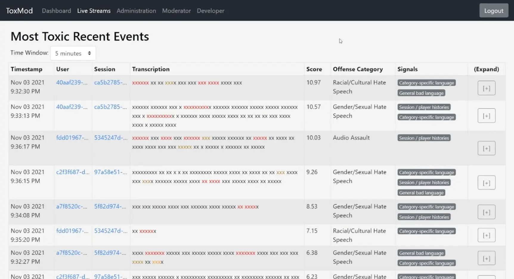
Screen from ToxMod
Conduct usability testing with our moderators
To ensure continuous improvement, I will conduct usability testing with our moderators and keep feedback channels open. This will allow me to gather valuable insights and make iterative adjustments to the system. We will also continue to assess the content reported to us and add more features as needed for specific use cases.
thank you for making it this far!
Reflection & learnings
Prioritizing Functionality
Functionality was more important than aesthetics. Making sure our tools were easy to use and met the needs of moderators was essential for efficiency and accuracy.
Keeping it simple
With a small user base and most of the team focused on the consumer-facing mobile app, I had to design within limitations in manpower and technical feasibility. Simplicity was key.
Planning for Growth
Designing for scalability is crucial for smaller companies. We built a solid foundation that can grow and adapt to future challenges, ensuring long-term success.
Reusing existing components
Reusing existing components made development faster and more consistent. This approach saved time and resources, allowing us to improve core functionalities.